Activewear Color Trends 2025: Top Shades for Modern Fitness Fashion
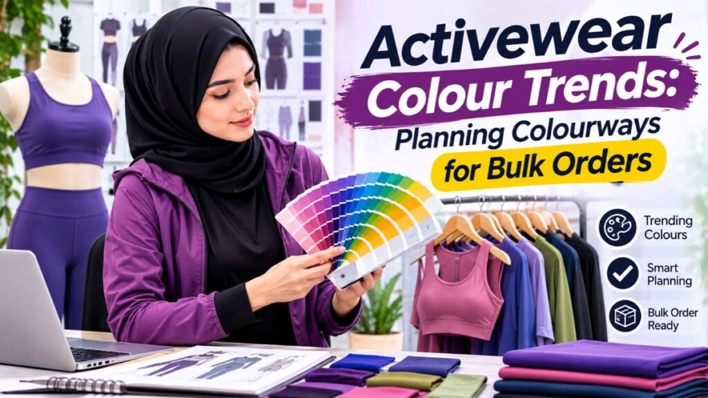
Activewear is no longer limited to basic black leggings and plain workout shirts. Color now plays an important role in how fitness clothing looks, feels, and connects with customers. In 2025, activewear collections are exploring a wider mix of earthy neutrals, energetic brights, soft pastels, and nature-inspired shades.
These activewear color trends 2025 offer fresh ideas for clothing brands, fashion designers, gym wear businesses, and sportswear manufacturers. Some colors create a calm and minimal appearance. Others bring energy, confidence, and personality to workout outfits.
For brands planning a new collection, choosing the right colors is an important design decision. A successful color palette should match the brand identity, suit the target audience, and work well across different fabrics and garment styles.
This guide explores the leading activewear colors of 2025, useful color combinations, fabric considerations, and practical tips for developing a coordinated fitness clothing collection.
Why Color Matters in Activewear Design
Color is one of the first details customers notice when shopping for workout clothing. It can influence how people perceive a product before they examine its fabric, fit, or construction.
For example, deep navy can create a clean and professional appearance. Bright orange may communicate energy and movement. Meanwhile, earthy brown shades can give an activewear collection a relaxed, lifestyle-focused look.
Color also helps brands create a recognizable visual identity. When customers repeatedly see a consistent palette, they may begin to associate those shades with the brand.
There are several reasons why color selection matters:
- Brand identity: A consistent palette helps customers recognize a clothing brand.
- Customer preferences: Different audiences may prefer different color families.
- Product coordination: Matching colors make it easier to create complete workout sets.
- Seasonal appeal: Seasonal shades help brands refresh their collections.
- Visual differentiation: Unique combinations can help products stand out in a competitive market.
However, color should not be selected only because it is popular. It should also suit the product, fabric, intended activity, and customer.
1. Mocha Brown and Warm Earthy Neutrals
<PRIVATE_PERSON> Mocha Mousse was selected as Pantone’s Color of the Year for 2025. This warm brown shade reflects comfort, richness, and understated elegance.
Its influence also makes earthy colors an interesting direction for activewear design. Shades such as chocolate brown, cocoa, caramel, warm taupe, and soft beige can create a refined alternative to traditional black workout clothing.
These colors work particularly well for:
- High-waisted leggings
- Sports bras
- Yoga sets
- Oversized gym shirts
- Zip-up jackets
- Matching athleisure outfits
Earthy neutrals are also easy to combine. For example, chocolate brown leggings can be paired with a cream sports bra. Similarly, mocha joggers can work with a beige hoodie.
For brands, these shades offer flexibility because customers can wear them during workouts and casual activities.
Design tip: Use matte fabric finishes to create a clean, understated look. Make sure the selected fabric maintains an even shade across the complete garment.
2. Cherry Red and Deep Burgundy
Red brings energy and confidence to activewear. In 2025, deeper red shades provide an attractive option for brands that want bold colors without relying entirely on neon tones.
Cherry red, wine red, burgundy, and dark crimson can give fitness clothing a strong visual identity.
These shades are suitable for:
- Performance leggings
- Sports bras
- Running tops
- Training shorts
- Tracksuits
- Lightweight gym jackets
A complete cherry-red matching set can create a bold appearance. Alternatively, a burgundy top with black leggings offers a more balanced combination.
Deep red also works well with neutral colors such as grey, cream, white, and charcoal.
When developing red garments, brands should test the fabric and dye carefully. Color consistency is especially important when matching tops and bottoms made from different materials.
3. Butter Yellow and Soft Yellow Tones
Butter yellow adds warmth without looking too intense. Unlike neon yellow, this softer shade creates a gentle and fresh appearance.
It can be used in spring and summer collections, especially for lightweight gym clothing and casual athleisure pieces.
Popular combinations include:
- Butter yellow with white
- Pale yellow with soft grey
- Yellow with chocolate brown
- Cream yellow with light blue
- Soft yellow with charcoal
For example, a pale yellow sports bra can be paired with grey leggings. A yellow oversized T-shirt can also work with neutral gym shorts.
However, lighter shades require careful fabric selection. Thin materials may become transparent when stretched, especially in fitted leggings and sports bras.
Therefore, brands should test opacity, stretch, and coverage before approving bulk production.
4. Electric Blue and Deep Cobalt
Blue remains a useful color family for sportswear because it offers many design possibilities. In 2025, stronger shades such as electric blue and cobalt provide a bold alternative to traditional navy.
Electric blue creates a noticeable appearance, making it suitable for statement pieces. Cobalt blue offers a slightly more balanced option for matching sets and performance clothing.
These shades can be used for:
- Running shirts
- Cycling jerseys
- Training shorts
- Compression tops
- Sports bras
- Performance jackets
Blue also combines well with white, black, silver-grey, and darker navy.
For a coordinated collection, a brand could use electric blue as its statement color and navy as its supporting shade. This approach creates variety while keeping the collection visually connected.
5. Sage Green and Nature-Inspired Shades
Nature-inspired colors remain an appealing direction for activewear. Sage green, olive, moss, and muted forest green create a calm and grounded appearance.
These shades are especially suitable for yoga clothing, outdoor fitness apparel, walking outfits, and lifestyle-focused sportswear.
Sage green works well with cream, beige, white, and soft brown. Olive green can be paired with black or charcoal for a more athletic look.
Brands can use these colors across several product categories:
- Yoga leggings
- Sports bras
- Relaxed-fit joggers
- Sweatshirts
- Outdoor training jackets
- Matching gym sets
Nature-inspired colors can also support a brand’s visual storytelling. However, using an earthy color does not automatically make a garment sustainable. Sustainability claims must be supported by the materials, manufacturing process, and relevant evidence.
6. Lavender and Soft Purple
Lavender and muted purple shades offer a softer direction for activewear. They can create a feminine, modern, and relaxed appearance without looking overly bright.
In 2025, soft purple tones can be used for both performance clothing and athleisure collections.
Useful shades include:
- Light lavender
- Dusty lilac
- Muted violet
- Soft orchid
- Deep plum
Lavender looks attractive with white, grey, pale pink, and charcoal. For a coordinated set, brands can combine a lilac sports bra with matching leggings.
Deep plum offers another option for customers who prefer darker colors. It can create a sophisticated appearance while providing more variety than black or navy.
When using pale purple shades, brands should check color consistency under different lighting conditions. The final garment should match the approved sample as closely as possible.
7. Soft Pink and Dusty Rose
Pink continues to offer opportunities for activewear brands, but softer versions can provide a more versatile alternative to highly saturated pink.
Dusty rose, blush pink, muted peach, and pale rose are useful shades for lifestyle-focused fitness collections.
These colors can work well in:
- Women’s leggings
- Sports bras
- Yoga sets
- Lightweight sweatshirts
- Gym tops
- Casual tracksuits
Soft pink can be paired with cream, grey, brown, and white. Dusty rose also works with burgundy for a coordinated tonal palette.
For brands, pink does not need to be limited to one product category. It can be introduced through small capsule collections, accessories, or selected pieces within a larger neutral collection.
8. Neon Orange and High-Energy Brights
Bright colors remain relevant for activewear, particularly in performance-focused collections. Neon orange, vivid coral, lime, and intense yellow can create a noticeable appearance.
These colors are often suitable for running, cycling, outdoor training, and sports clothing.
However, using too many bright shades in one outfit may make the design look visually crowded. A more balanced approach is to use one bright color with neutral supporting shades.
For example:
- Neon orange with black
- Bright coral with charcoal
- Lime with navy
- Vivid yellow with dark grey
Brands can also use bright shades in smaller design details, such as piping, panels, logos, or zipper accents.
This allows a collection to feel energetic without making every garment visually intense.
9. Charcoal, Graphite, and Modern Grey
Black remains a familiar activewear choice, but grey offers brands another practical neutral option.
In 2025, charcoal, graphite, steel grey, and soft grey can support minimalist and performance-focused collections.
Grey works across different garment categories, including leggings, joggers, hoodies, compression tops, and training shirts.
It also pairs easily with stronger colors. For example, a graphite legging can be combined with a cherry-red sports bra. Similarly, a charcoal hoodie can work with sage-green joggers.
For clothing brands, grey can help create products that customers can mix with different pieces from their wardrobes.
10. Cream, Oatmeal, and Off-White
Cream and oatmeal shades offer a softer alternative to bright white. They create a clean, relaxed appearance and fit naturally into neutral activewear collections.
These shades are suitable for:
- Oversized T-shirts
- Sweatshirts
- Joggers
- Yoga tops
- Casual activewear sets
- Lightweight jackets
Cream can be combined with mocha, sage green, dusty pink, and charcoal. This makes it useful for collections built around mix-and-match pieces.
However, off-white fabrics may require additional attention during production. Brands should check fabric opacity, staining, and color consistency before approving the final product.
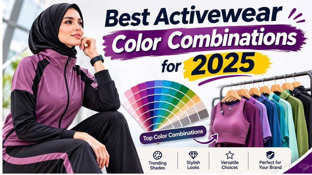
Best Activewear Color Combinations for 2025
A strong color palette is not only about choosing individual shades. The way colors work together can influence the entire appearance of a collection.
Here are some combinations brands can explore:
| Color combination | Overall appearance | Suitable products |
|---|---|---|
| Mocha and cream | Warm and refined | Yoga sets, joggers |
| Cherry red and charcoal | Bold and athletic | Leggings, training tops |
| Sage green and beige | Natural and relaxed | Outdoor activewear |
| Lavender and grey | Soft and modern | Sports bras, leggings |
| Cobalt and white | Fresh and energetic | Running clothing |
| Butter yellow and brown | Warm and casual | T-shirts, gym sets |
| Burgundy and blush pink | Rich and coordinated | Matching sets |
| Neon orange and black | High-energy and sporty | Performance clothing |
These combinations are starting points rather than fixed rules. Brands should test them with their own designs, target customers, and fabric choices.
How to Choose the Right Colors for Your Activewear Brand
Choosing a popular color does not guarantee that a product will perform well in the market. The best palette should match the brand’s identity and customer expectations.
Consider the following factors before finalizing your collection.
1. Understand Your Target Audience
Start by identifying the customers your brand wants to serve.
For example, a yoga-focused brand may prefer soft neutrals, lavender, sage green, and warm brown. In comparison, a performance training brand may use cobalt, red, charcoal, and energetic accents.
Consider the age group, lifestyle, product preferences, and activities of your target audience.
2. Match Colors With Product Types
Different products may need different color strategies.
A running collection can include bright shades for visibility and visual energy. Yoga clothing may benefit from calm colors and coordinated sets.
Meanwhile, everyday athleisure can use versatile neutrals that customers can wear outside the gym.
3. Build a Balanced Color Palette
A collection should have a clear color structure.
One practical approach is to divide colors into three groups:
- Core colors: Black, navy, charcoal, and neutral shades.
- Seasonal colors: Mocha, sage, lavender, and butter yellow.
- Accent colors: Cherry red, electric blue, and neon orange.
Core shades provide continuity. Seasonal colors keep the collection fresh, while accent shades add visual interest.
4. Consider Fabric and Color Performance
A color may look different depending on the fabric composition, surface texture, and finish.
For example, polyester and nylon fabrics may display colors differently from cotton or cotton blends. Stretch fabrics also need testing because the appearance of a shade can change when the garment is extended.
Therefore, request fabric swatches and physical samples before approving production.
5. Test Colors in Different Lighting
Colors can look different under daylight, indoor lighting, and photography equipment.
A shade that looks attractive in a digital design may appear warmer or cooler on the finished garment.
Brands should review physical samples under different lighting conditions. This step helps reduce unexpected differences between product photography and delivered stock.
How Fabric Choice Affects Activewear Colors
Fabric selection is closely connected to color development. The same shade may look different on two materials because of their texture, composition, weight, and surface finish.
Polyester
Polyester is widely used in performance clothing. It is suitable for many sportswear applications and can be used with different dyeing and printing methods.
Brands often select polyester for running shirts, training tops, and lightweight activewear.
Nylon and Spandex Blends
Nylon blended with spandex is commonly used for fitted activewear. The combination can provide a smooth feel, stretch, and flexibility.
It is useful for leggings, sports bras, and compression-style garments. However, brands should test the fabric’s color appearance during stretching.
Cotton Blends
Cotton blends are suitable for many casual activewear products. They can provide a soft feel and work well for relaxed T-shirts, sweatshirts, and joggers.
Their final appearance depends on the blend, fabric construction, and finishing process.
French Terry and Fleece
French terry and fleece are useful for sweatshirts, hoodies, and tracksuits.
They can support neutral and rich colors such as mocha, charcoal, burgundy, and olive. Fabric weight and surface texture should be considered when choosing the final shade.
Important Color Checks Before Bulk Production
Color approval should be part of the product development process. A brand should not rely only on a screen image or a reference photograph.
Before bulk manufacturing, consider these checks:
Fabric swatches: Review the selected shade on the actual fabric.
Lab dips: Request color samples prepared for the chosen material and dyeing process.
Sample approval: Check the finished garment before authorizing bulk production.
Color consistency: Confirm that different fabric panels and matching pieces look consistent.
Wash testing: Check whether the shade changes after washing.
Light and rubbing tests: Where appropriate, evaluate colorfastness under relevant testing methods.
Production records: Keep approved color references and specifications for future orders.
These steps help reduce color differences and support consistent product quality.
How Activewear Brands Can Use 2025 Color Trends in Their Collections
Brands do not need to use every popular shade. A focused collection with a clear design direction can be more effective than a large assortment of unrelated colors.
Here are practical ways to apply the trends.
Create Matching Sets
Matching leggings and sports bras remain a useful product format. A coordinated mocha, sage, burgundy, or lavender set can create a complete look.
Make sure both garments use compatible fabrics and color references.
Introduce Seasonal Capsules
A brand can keep its core colors throughout the year while introducing a small seasonal collection.
For example, a spring capsule could include butter yellow, lavender, and soft pink. A colder-season collection could use mocha, burgundy, olive, and charcoal.
Combine Neutrals With Statement Shades
Neutral colors provide flexibility, while brighter shades add personality.
A collection could include charcoal leggings with electric-blue tops or cream joggers with cherry-red sweatshirts.
Use Color Blocking
Color blocking uses two or more contrasting colors in one garment.
It can be applied through side panels, shoulder sections, waistband details, or sleeve designs. However, the colors should complement each other and fit the brand’s overall style.
Develop a Consistent Brand Palette
Select a small group of recognizable colors that can appear across different products.
This creates visual consistency between leggings, tops, jackets, hoodies, and accessories.
How Fashion Soul International Supports Custom Activewear Production
Choosing a color palette is only one part of developing an activewear collection. Brands also need suitable fabrics, accurate samples, garment construction, decoration, and production planning.
Fashion Soul International is a factory-owned custom clothing manufacturer based in Sialkot, Pakistan. The company supports apparel brands with product development, fabric sourcing, sampling, bulk manufacturing, quality control, custom branding, and packaging.
Its manufacturing options include private-label, OEM, ODM, white-label, and cut-and-sew production.
For activewear projects, brands can discuss product requirements such as:
- Fabric composition and GSM
- Stretch and recovery requirements
- Color references and fabric swatches
- Legging and sports bra construction
- Custom labels and branding
- Printing and embroidery options
- Packaging requirements
- Sample development and approval
The standard MOQ starts at 100 pieces, although actual requirements can vary by product, fabric, color, and construction.
A physical pre-production sample should be reviewed and approved before bulk production begins. This gives the brand an opportunity to check the fit, fabric, color, stitching, and finishing.
Fashion Soul also describes inline quality checks and pre-shipment AQL 2.5 inspection as part of its quality process.
For brands planning a new activewear range, clear product specifications and approved color references can make communication with the manufacturer more effective.
Common Mistakes to Avoid When Selecting Activewear Colors
Even a strong color palette can create problems if it is not planned properly.
Avoid these common mistakes:
Following every trend: Not every popular shade will suit your brand or customers. Select colors that support your product identity.
Ignoring fabric differences: A shade may look different on polyester, nylon, cotton, and fleece. Test the actual material.
Choosing colors only from digital images: Screen displays are not reliable substitutes for physical color samples.
Using too many statement shades: A collection can become visually inconsistent when every product uses a different bright color.
Skipping wash testing: Some fabrics may lose color or change appearance after washing.
Ignoring product coordination: Matching tops and bottoms should be checked together before bulk approval.
Making unsupported sustainability claims: Earthy colors do not prove that a garment uses sustainable materials or processes.
A planned color development process can help brands avoid these issues.
Frequently Asked Questions
What are the top activewear color trends in 2025?
Some notable directions include mocha brown, cherry red, butter yellow, electric blue, sage green, lavender, dusty rose, charcoal, cream, and energetic neon shades. The best choices depend on the brand and product category.
Is brown a popular color for activewear in 2025?
Brown is an important color direction for 2025. Mocha, cocoa, chocolate, and caramel shades offer warm alternatives to traditional black and grey.
Which colors are best for gym wear?
Black, charcoal, navy, burgundy, cobalt, and selected bright shades are useful options for gym wear. Brands should consider customer preferences, product function, and fabric performance.
Are pastel colors suitable for activewear?
Yes. Lavender, blush pink, butter yellow, and pale blue can work well in activewear. However, fitted garments should be tested for opacity and coverage.
How should a brand choose activewear colors?
Start with your target audience and brand identity. Then select core, seasonal, and accent shades. Test the colors on the actual fabric before approving production.
Does fabric affect the appearance of activewear colors?
Yes. Fabric composition, texture, weight, dyeing, and finishing can change how a shade appears. Stretch can also affect the visible color of fitted garments.
How can brands maintain color consistency during production?
Use approved color references, fabric swatches, lab dips, and pre-production samples. Also, check color consistency during production and perform suitable colorfastness tests.
Can small clothing brands create custom-colored activewear?
Yes. Small brands can discuss custom colors and product requirements with manufacturers. However, MOQ, fabric availability, dyeing requirements, and production costs should be confirmed before placing an order.
Conclusion
The activewear color trends 2025 show how fitness fashion can combine practical design with personal style. Warm mocha shades, earthy greens, rich reds, soft pastels, electric blues, and energetic brights give brands many ways to create fresh collections.
However, successful color selection involves more than following seasonal trends. Brands should consider their customers, fabric choices, product categories, and overall identity.
Most importantly, every color should be tested on the actual material before bulk production. With clear specifications, physical samples, and careful quality checks, brands can develop activewear collections that look consistent and feel well planned.
Whether you are launching a new fitness label or expanding an existing clothing range, a thoughtful color palette can help give your activewear collection a clear and recognizable direction.